Flex Layout 2.0
Flexible Web Components Grid System
Flex Layout - a library of web components for creating flexible flex layouts on your website.
<!-- Main container -->
<flex-canvas w="1200px">
<!-- Grid layout with responsive gap -->
  <flex-grid compact crop gap="50px, xs 10px, sm 20px, md 40px">
  <!-- Flexbox container with responsive width -->
    <flex-box center wrap dn="row, xs column">
      <flex-cell w="50%, sm 100%">
      <!-- Custom Style Box -->
        <s-box center bgc="red" pd="20px, sm 10px">
          Box 1
        </s-box>
      </flex-cell>
      <flex-cell w="50%, sm 100%">
        <s-box center bgc="green" pd="20px, sm 10px">
          Box 2
        </s-box>
      </flex-cell>
    </flex-box>
  </flex-grid>
</flex-canvas>
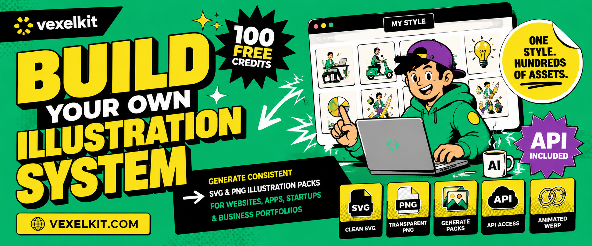
Build your own illustration system with VexelKit
VexelKit lets you generate consistent SVG & PNG illustration packs from a single reference. Create a unified illustration style once and produce hundreds of matching assets for websites, apps, startups and business portfolios — with clean SVG, transparent PNG, animated WebP and API access. Get 100 free credits to start.

Introducing Flex Layout: Empowering
Effortless Web
Design
Flex Layout System v2 is a streamlined and powerful library of web components designed to make responsive web design effortless. This new version introduces significant improvements, including a reduced number of components, built-in responsive behaviors, and self-contained styles, making it easier than ever to create clean, maintainable layouts across various projects and frameworks.
Key features of Flex Layout System v2 include its simplified component structure, which reduces the need for complex HTML setups.
With just a single import, Flex Layout System v2 integrates seamlessly into any project or framework. Its components come with built-in responsive capabilities, eliminating the need for additional media queries or external CSS files. The library also includes supplementary tools for precise control over gaps, grids, columns, and overall layout, ensuring rapid development with minimal CSS.
Get Started
To get started with Flex Layout System, follow these simple steps:
Step 1: Install the package Run the following command in your project to install the Flex Layout System package from npm:
npm install flex-layout-systemStep 2: Use It!
// ES/TS Project:
import "flex-layout-system";
If yow want to use this library in your HTML file (browser), you can use the following:
<script src="https://unpkg.com/flex-layout-system/dist/browser.min.js"></script>
Angular
If you want to use this library in your Angular project, you can use the following:
npm install flex-layout-system
Finally, in your app.module.ts file, add the following:
import "flex-layout-system";
import { CUSTOM_ELEMENTS_SCHEMA, NgModule } from '@angular/core';

@NgModule({
  ...
  schemas: [CUSTOM_ELEMENTS_SCHEMA],
})
NextJS
If you want to use this library in your NextJS project, you can use the following:
npm install flex-layout-system
"use client"; // This is required for NextJS. Add this line at the top of the file, but not in page.ts file.
              // Instead, create a new file in the components folder and import it in the page.ts file with this line.

import "flex-layout-system/jsx.types.d"; // Import types
import "flex-layout-system"; // Import components

// Just use the web components in your JSX file, for example:
<flex-box jc="space-between">
  <span>1</span>
  <span>1</span>
</flex-box>
Please note that this library uses Shadow DOM and is a purely client-side library, meaning it will only work on the client side. You can write syntax similar to regular HTML, but rendering will be handled exclusively on the client.
Additionally, you must ensure the library is imported on the client side. If you're using
"use client",
Next.js will handle the import correctly. However, if you're working with a server component, it won't render!
You must ensure the script is loaded on the client side, either using lazy loading methods provided by Next.js
or by utilizing
Script from next/script to load the library as a polyfill for web component support
on the client.
import Script from "next/script";

export default function MyComponent() {
  return (
    <>
      <Script src="https://unpkg.com/flex-layout-system/dist/browser.min.js" strategy="lazyOnload" />
      <flex-box jc="space-between">
        <span>1</span>
        <span>2</span>
      </flex-box>
    </>
  );
}
Examples
A real-life example is this very website! Simply open the DevTools and explore the working example firsthand. Additionally, below you will find examples for each component, showcasing their usage in different scenarios. For more detailed information and documentation, please refer to our official documentation
How to Use Grid and Flexbox
<!-- Use grid for accurate layout with gap -->
<flex-grid gap="20px">
  <flex-box>
    <flex-cell bs="50%">
      <flex-grid compact gap="50px">
        <flex-box>
          <flex-cell stretch><s-box bgc="red" block center>1</s-box></flex-cell>
          <flex-cell stretch><s-box bgc="red" block center>2</s-box></flex-cell>
        </flex-box>
      </flex-grid>
    </flex-cell>
    <flex-cell bs="50%">
      <!-- Direct flex-box usage with gap -->
      <flex-box gap="20px">
        <flex-cell stretch><s-box bgc="red" block center>1</s-box></flex-cell>
        <flex-cell stretch><s-box bgc="red" block center>2</s-box></flex-cell>
      </flex-box>
    </flex-cell>
  </flex-box>
</flex-grid>

<!-- Use flex-box directly when grid is not needed -->
<flex-box wrap gap="20px">
  <s-box bgc="blue" block>Flexible Item 1</s-box>
  <span>Flexible Item 2</span>
</flex-box>
When building layouts, it's recommended to use `flex-grid` with the `gap` attribute to ensure accurate spacing between grid cells. This approach is preferable because the grid gap maintains logical spacing and doesn't interfere with percentage-based widths.
In contrast, using `gap` directly within `flex-box` can lead to unexpected spacing issues when dealing with percentage-based layouts, as it relies on padding rather than pure gaps.
Inside a grid, it's best to use `flex-box` for internal layout control, particularly when nesting grids. For deeper grids, it's advisable to place another `flex-grid` inside a `flex-cell`, although a direct `flex-box` is also an option depending on your layout logic.
It's crucial to use `flex-cell` within `flex-box` when working with grids, as the grid gap feature relies on these cells. Skipping `flex-cell` will prevent the grid's gap from functioning correctly.
However, if you just need a flexible container without the structure of a grid, you can use `flex-box` directly. It behaves as a standard flex container, allowing you to nest any elements inside it, not just `flex-cell`.
Components
Canvas
<flex-canvas>
...
</flex-canvas>

<!-- You can set the custom width and padding -->
<flex-canvas w="1200px" pd="2em">
...
</flex-canvas>

<!-- You can disable the centering -->
<flex-canvas mg="0">
...
</flex-canvas>
The FlexCanvas component is a simple container that limits the width of its content and centers it horizontally. It provides a straightforward way to create a container with a fixed width and centered content.
By using the FlexCanvas component, you can easily ensure that your content stays within a specific width and maintains a visually balanced appearance. It helps in achieving a clean and organized layout by providing a centralized alignment for the content.
The FlexCanvas component serves as a foundational building block for your layout design, allowing you to create structured and visually pleasing arrangements. Its simplicity makes it versatile and suitable for various use cases, whether you're working on a small website or a large-scale application.
Grid
<flex-grid gap="20px">
  ...
</flex-grid>

<!-- You can use compact to remove padding -->
<flex-grid compact>
  ...
</flex-grid>

<!-- Set responsive gap values -->
<flex-grid gap="50px, xs 10px">
  ...
</flex-grid>

<!-- Enable crop to hide overflow content -->
<flex-grid crop>
  ...
</flex-grid>
FlexGrid: The main container for creating grid-based layouts.
The FlexGrid component allows you to organize your layout using a grid system. You can customize the gap between grid items and control overflow behavior with the `crop` attribute.
With FlexGrid, you can set responsive gap values, apply compact mode to remove padding, and ensure your content stays neatly within the grid.
Box
<flex-box center>
...
</flex-box>

<!-- You can set the direction column/row -->
<flex-box column>
...
</flex-box>

<!-- You can set the flex gap -->
<flex-box gap="20px">
...
</flex-box>

<!-- You can set the responsive flex direction and wrap -->
<flex-box wrap="nowrap, xs wrap" dn="row, xs column-reverse">
...
</flex-box>

<!-- and other useful properties -->
<flex-box ai="center">
...
</flex-box>
FlexBox: A versatile component for creating row or column layouts.
The FlexBox component is a highly flexible and multipurpose container that allows you to easily create both row and column layouts. Traditionally referred to as "row" or "column," we've combined these two functionalities into a single component for convenience and efficiency. The main distinction between them lies in the direction property, making it unnecessary to create separate components for each orientation.
With the FlexBox component, you can effortlessly switch between row and column layouts based on responsiveness. This is particularly useful when transitioning from a horizontal row layout to a vertical column layout as the screen size changes. By utilizing the FlexBox component, you can achieve a seamless and adaptive design that accommodates various device dimensions.
The FlexBox component offers a range of configuration options, such as defining the alignment, spacing, and order of its child elements. It provides the flexibility required to create complex and dynamic layouts while maintaining a clean and structured design.
Cell
<flex-cell w="50%, xs 100%">
  ...
</flex-cell>

<!-- Use 'fill' to make the cell expand -->
<flex-cell fill>
  ...
</flex-cell>

<!-- Set responsive width and padding -->
<flex-cell w="75%" pd="10px, xs 5px">
  ...
</flex-cell>

<!-- Align content to the center -->
<flex-cell center>
  ...
</flex-cell>
FlexCell: The building blocks within the FlexBox.
FlexCell allows you to create flexible and responsive grid cells with a wide range of customization options.
You can control the size, alignment, order, and more, making it easy to create complex and adaptive layouts.
DisplayBox
<d-box d="block, xs none">
  ...
</d-box>

<!-- Conditionally render based on media query -->
<d-box media="(min-width: 600px)">
  ...
</d-box>

<!-- Use the 'd' attribute for responsive display -->
<d-box d="flex, md grid">
  ...
</d-box>
DisplayBox: A versatile component for conditional rendering.
The DisplayBox component allows you to control the rendering of content based on a media query (`media` attribute) or simply through responsive display settings using the `d` attribute.
You can use DisplayBox to dynamically show or hide content depending on screen size, device type, or any other conditions supported by `matchMedia`.
SpaceBox
<space-box size="20px"></space-box>

<!-- Responsive size for spacing -->
<space-box size="40px, xs 10px"></space-box>

<!-- Full width spacing -->
<space-box wf></space-box>

<!-- Stretch to fill available space -->
<space-box stretch></space-box>
SpaceBox: The simplest component for creating responsive spacing.
The SpaceBox component provides flexible and responsive spacing within layouts. You can easily adjust its size or make it stretch to fill available space.
With the `size` attribute, you can define a specific size for the space, and even make it responsive. Use `wf` or `hf` for full width or height, and `stretch` to expand and fill available space.
StyleBox
<s-box w="100%" h="300px" bgc="lightblue" ta="center" pd="20px">
  Content centered with padding
</s-box>

<!-- Responsive padding and margin using logical properties -->
<s-box pd="20px, sm 10px" mg="10px, sm 5px">
  Responsive padding and margin
</s-box>

<!-- Center content and apply circular shape -->
<s-box center round w="100px" h="100px" bgc="red">
  Circle
</s-box>

<!-- Use sr-only for screen readers only content -->
<s-box sr-only>
  Screen reader only content
</s-box>

<!-- Apply object-fit to images or videos -->
<s-box object-fit="cover" fit>
  <img src="image.jpg" alt="Cover Image">
</s-box>
StyleBox: A highly customizable component for styling and layout control.
The `StyleBox` component supports a wide range of CSS properties, making it ideal for creating responsive layouts. It includes support for logical properties like padding and margin, ensuring LTR and RTL compatibility.
With `StyleBox`, you can apply styles like background color, padding, margin, and more directly within your HTML. It also supports responsive styles through attributes like `pd`, `mg`, and `w`, making it easier to adapt to different screen sizes.
Additional features include options for centering content, creating circular shapes, and hiding content visually but keeping it accessible for screen readers with the `sr-only` attribute. The `object-fit` property allows you to control how images and videos fit within their container.
Responsive Features
<s-box ta="center, sm start" d="block, xs none">
  Content centered with padding
</s-box>

<!-- Responsive padding and margin using logical properties -->
<s-box pd="20px, sm 10px" mg="10px, sm 5px">
  Responsive padding and margin
</s-box>

<!-- Center content and apply circular shape -->
<s-box center round w="100px, xs 50px" h="100px, xs 50px" bgc="red">
  Circle
</s-box>
Responsive Features: Flex Layout System provides robust tools for creating layouts that adapt to any screen size.
The system supports a range of predefined breakpoints: `xs`, `sm`, `md`, `lg`, `xl`, and `xxl`, which correspond to common screen sizes. You can define responsive styles for properties like padding, margin, width, height, and more using these breakpoints.
For example, the `pd` (padding) and `mg` (margin) attributes allow you to specify different values for different breakpoints, ensuring that your layout looks great on any device.
Additionally, you can customize media sizes globally by setting the `DEFAULT_MEDIA_SIZES` in your JavaScript code. This flexibility allows you to fine-tune your design to meet specific project requirements.